Good native applications take advantage of subtle transitions from page to page that give life to the application and achieving this just became easier for web applications.
Previously, a combination of Typescript and CSS was required to replicate transitions like that of a native app. But thanks to the “CSS View Transitions” API, it just became a lot easier. It’s as simple as calling .startViewTransition() and you’ve already implemented a cross fade transition from one page to another.
Choosing when and where to use these transitions in a PWA is arguably more important than using them in the first place. Implementing a consistent and accessible set of transitions across a PWA can give your app that native feel but using transitions out of place can ruin the feel of the app all together.
This blog will cover some transition tricks that will help upgrade Progressive Web Apps and give it them more of a native feel.
Technical Context
This blog post uses the PWA Starter to implement view transitions.
The PWA Starter is PWABuilder’s opinionated Progressive Web App template that lets you jump into building a PWA with little technical overhead.
Types of Transition
Each type of transition has an optimal situation where it is best to use them. So, before deciding which transition to use, it might be best to understand what you are trying to achieve by using the transition in the first place.
- Are you having to load data during this transition?
- How related are the pages that you are transitioning between?
- Do any of the page elements need to persist when the page transitions?
The answers to these questions can help decide what type of transition to use and when. Three common types of transition that can fit different scenarios are:
- Top level: Usually, a crossfade between pages with unrelated content. Seen often with navigation bars or menus.
- Container transform: This is to be used to transition hero elements of a container from one page to another. This might look like a preview image expanding to take up more space on the hero section of the next page or title text from a store card element transitioning to the heading of a product description page.
- Forward and Backward: This transition describes the movement from one page to another forward and backward. This is seen a lot on settings pages where you are clicking deeper into a hierarchy. This is the classic slide in/slide out page transition.
Our main goals with transitions are to distract users from loading/page refreshes, to give life to our PWA through the movement from the transitions, and to make our PWA feel closer to that of a native application.
The last bit of context I want to add is that for accessibility, we can use the prefers-reduced-motion CSS query to toggle the movement from these transitions on and off. It is important to take the time to implement this toggle to keep the web accessible for all.
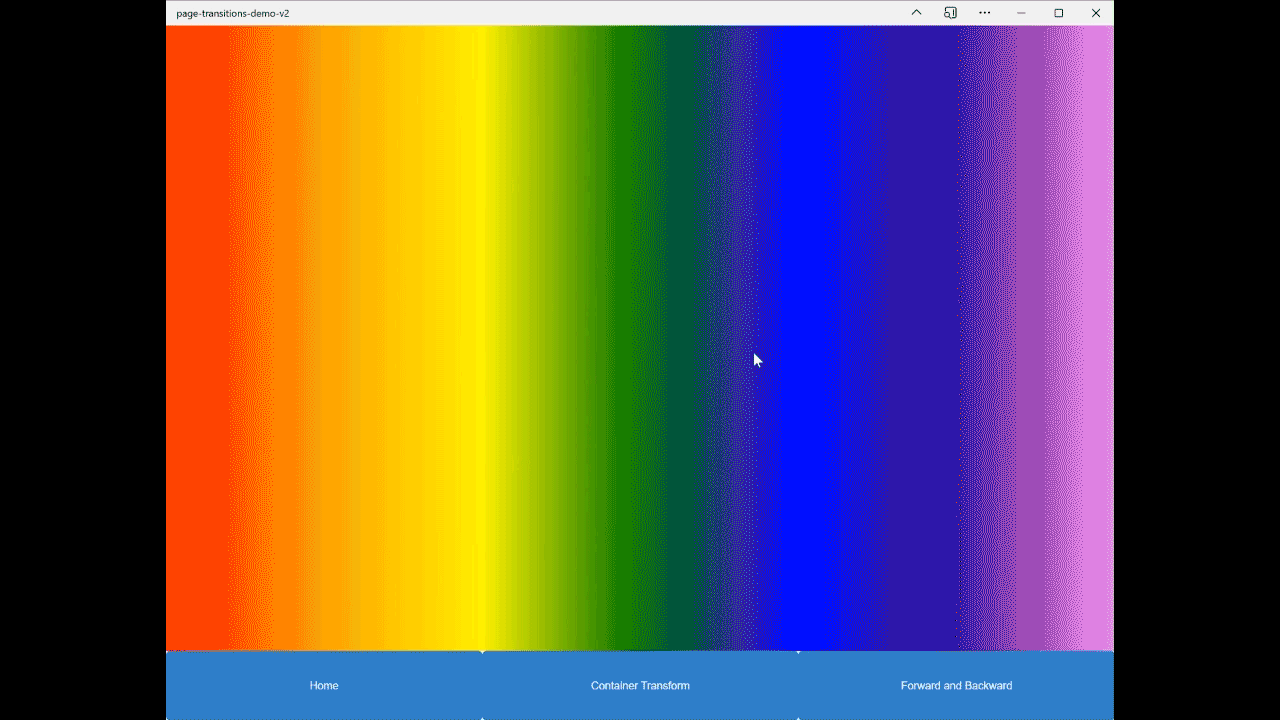
The Top Level Transition
The top-level transition is often used when a page switch occurs from a navigation menu. This transition will use a cross-fade, which is the default behavior for startViewTransition.
Our handlePageChange function looks like this:
handlePageChange(page){
  if ("startViewTransition" in document) {
    return (document as any).startViewTransition(() => {
      Router.go(page);
    });
  } else {
    Router.go(page);
  }
}
The above code runs whenever a navigation item is clicked in the sample app. If the browser is compatible with the View Transitions API, the view transition will start and then we will route to our next page. If the API is unavailable, we just route normally. Without any additional code, this alone completes the top-level transition.
In order to alter the transition, the pseudo-selectors ::view-transition-old() and ::view-transition-new() can be used as follows:
::view-transition-old(root),
::view-transition-new(root) {
  animation-duration: .25s;
}
This ensures the animation completes in a fourth of a second. Other traditional animation CSS, like transform or animation delay, can be used here to achieve all kinds of effects. In the snippet above, notice the “root” being selected, this is the animation name. If you are using one animation, root is the default target and will suffice. However, if there are multiple animations in use, it will be necessary to isolate each animation by giving them unique names. We will explore this more in the next section.
The result:
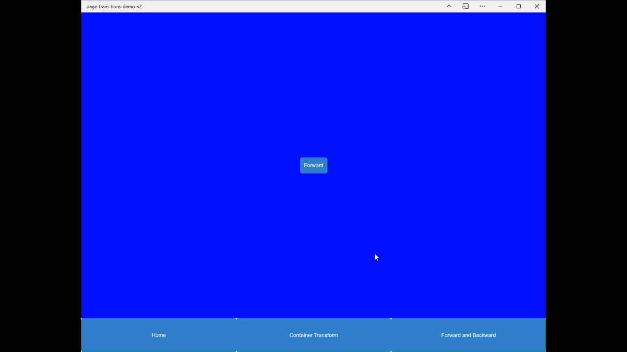
Forward and Backward
Another common page transition is the forward and backward transition. With this transition, the goal is to slide from one page toward the direction of next, whether that be forward or backward. For the sample app, under the “Forward and Backward” tab, there are two pages, one with a forward button and one with a back button. On click of the forward button, the following code was run:
async handleForward(){
  let host = this.shadowRoot!.host;
  if ("startViewTransition" in document) {
    //@ts-ignore
    host!.style.viewTransitionName = 'forward';
    // @ts-ignore
    const transition = document.startViewTransition();
    Router.go(`/backward-page`);
    await transition.finished;
    // @ts-ignore
    host!.style.viewTransitionName = '';
  } else {
    Router.go(`/backward-page`);
  }
}
And on the backwards page, the following CSS is necessary:
:host {
  view-transition-name: forward;
}
This time, the name of the transition (which again, must be unique) is set as forward, the transition executes, and the transition name is removed when the process is completed. The CSS on the backwards page is telling the API that the host of the backwards page is the “element” that is being transitioned, which in the context of the sample app, refers to the whole backwards page. To achieve the sliding effect, the following CSS is required:
@keyframes slide-from-right {
  from { transform: translateX(100%); }
}

@keyframes slide-to-left {
  to { transform: translateX(-100%); }
}

::view-transition-old(forward) {
  animation: 600ms cubic-bezier(0.4, 0, 0.2, 1) both slide-to-left;
}

::view-transition-new(forward) {
  animation: 600ms cubic-bezier(0.4, 0, 0.2, 1) both slide-from-right;
}
Notice this time inside of the ::view-transition-old/new selectors, specific transition names are targeted which allows for different behaviors for the different transitions.
To do the same effect but backwards, you would use the following CSS:
@keyframes slide-to-right {
  to { transform: translateX(100%); }
}

@keyframes slide-from-left {
  from { transform: translateX(-100%); }
}

::view-transition-old(backward) {
  animation: 600ms cubic-bezier(0.4, 0, 0.2, 1) both slide-to-right;
}

::view-transition-new(backward) {
  animation: 600ms cubic-bezier(0.4, 0, 0.2, 1) both slide-from-left;
}
The result:
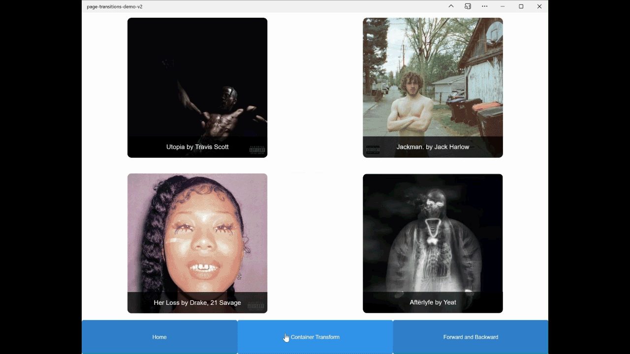
Container Transform
The previous transitions have been focused on transitioning between pages with unrelated content. What if there were elements on one page that we wanted to persist to the next? That is where the Container Transform transition type should be used. This transition type has a lot of moving pieces, so it is important to remember to keep the transition clean. We do not need any extra bouncing movements as the transition completes, we want to move our elements along one axis and make sure the elements do not overlap or cause other elements to shift. You can see examples of what NOT to do for this transition type on the Material Designs demonstration.
In the sample app, my “persistent element” is album art and when clicked, it will come front and center on a new page with the respective track list. Like using startViewTransition page to page, using it for an element automatically does a default sliding animation from its old location to its new location. The Typescript is very close to that of the forward and backward transition:
async handleAlbumClick(name: string, index: number){
  let album: HTMLElement = this.shadowRoot!.querySelector(`[data-name="${name}"]`)!
  if ("startViewTransition" in document) {
    //@ts-ignore
    album!.style.viewTransitionName = 'container-transform';
    // @ts-ignore
    const transition = document.startViewTransition();
    Router.go(`/album-details/${name}/${index}`);
    await transition.finished;
    // @ts-ignore
    album!.style.viewTransitionName = '';
}
And to link the album cover on the old page to the album on the new page, give the view-transition-name of “container-transform” to the album art on the new page.
The track list on the album art details page did not persist from the previous page so it has nothing to do with page transitions. To give it movement still, using normal CSS animations the tracklist will reveal itself as the album art is sliding into place. A reminder that using the View Transitions API in tandem with the CSS animations that we are used to is completely acceptable.
The result:
Conclusion
This is only the beginning of the power of page transitions and with this technology only being a few months old, there is only more to come. If you want to do some reading about the feature I would recommend the Chrome Developer article which breaks down the API completely with code examples via a demo app. For more information about the different types of transitions and when to use them, check out the Material Design article. It is exciting to see this API be used more widespread and who knows, maybe PWABuilder.com will be the next site to see some of this stuff in use!